30 years of graphical interfaces, that great strides! History and considerations…
Webdesigner Depot è su published an article very interesting, in English, which is an examination of the history of the GUI since the late 70, to date. E'sicuramente an opportunity to talk about and make personal considerations.
Anyone who uses or has used a Macintosh, will surely come to knowledge of which inspired the first Apple operating systems: the GUI of the Xerox Alto, dated 1973.
As you can see from the link above and the following image, The first feature that is immediately evident is that the monitor had a vertical orientation, type portrait.

The first gui, Xerox Alto, click to enlarge
As well as (here you can already recognize an embryo of what will Mac OSX) the next 8010 Star, always says Xerox.

Xerox 8010 Star, click to enlarge
And here, precisely, the first embryo Apple, Lisa OS, which served as a springboard for Apple Macintosh OS, dated 1983

Apple Lisa OS, 1983, click to enlarge
On the other hand, IBM PC side you watched, and the following year he was released Visi On, the VisiCorp, shown here… the program Calc vaguely reminiscent Framework, spreadsheet for Dos released, Creed, in the late '80s, those who remember?

VisiON, the first GUI for IBM PC, click to enlarge
And here, Finally, in 1984, the first version of Mac OS, il System 1.0 (remember that Leopard would actually release 5 Part System 10). We see a real GUI with the ability to use the mouse and organize your desktop using the windows.

Apple System 1.0, click to enlarge
Also in those years early versions of what will be Microsoft Windows, the Amiga Workbench, and the GEOS for the Commodore 64 (glorious C64…)

Amiga Workbench 1.0

Microsoft Windows 1.0, click to enlarge

GEOS for the Commodore64
Much like the future of Windows 3.1, OS / 2 was developed by IBM and Microsoft.
The icons were monoscromatice fixed size.

OS / 2, click to enlarge
Meanwhile in Apple's continued innovations, and in 1991 si giunse al System 7.0, where you start using the first color beyond the gray.

MacOS 7.0, click to enlarge
Finally, year of grace 1992, Microsoft Windows is released 3.1.
Are used for the first time the famous characters True Type and a high-contrast color scheme to help users with visual impairments.

Microsoft Windows 3.1, click to enlarge
Following, 3 years after, from the known Windows '95. The GUI was redesigned, was aggiungta the X closing, in the upper right of the window, as well as the famous START, in the taskbar, which opened the MENU’ START, still present in Windows.
The next Windows 98 made no particular benefits, the GUI was essentially the same, and was followed shortly after by the Windows 98 It, indicating a system really badly (who does not remember the serious security flaws, instability, i virus?)

Microsoft Windows 95, click to enlarge

Microsoft Windows 98, click to enlarge
The Open Source community that was slowly becoming more and more numerous, meanwhile, wanted the * NIX operating systems are not exclusively the prerogative of the server, and we went to work to create a Desktop Environment user-friendly, if possible not unlike Windows: KDE 1.0, dated 1998

KDE 1.0, click to enlarge
The similarity with Windows was, and remained until the end of KDE3.
More independent of KDE, the following year saw the light of GNOME, included in the first versions of Red Hat.

Gnome 1.0, click to enlarge
Finally, the new millennium, came to light GUI in which we are now so accustomed: that of Mac OSX, Windows XP, KDE3.
Anti aliasing, True Type, 32bit, 16 million colors, ability to change the skin to better personalize the look and feel of your system were the strengths of the GUI of the millennium.

Apple MAC Osx 10.1, click to enlarge

Microsoft Windows XP, click to enlarge

KDE 3, click to enlarge
not bad, true? If you think the first experiments about old 30 age, need to rub your eyes!
Nowadays the situation has improved even more, with 4 GUI which control the ranking incontrastatamente: that of Windows Vista (soon supplanted by Win 7), MAC OSX 10.5 Leopard, KDE4, Gnome 2.24.
With more and more powerful video cards, it was possible to relieve the CPU of some calculations that concerned the display of the gui, and use new and innovative effects such as transparencies, blur for windows in the background, steps between the windows in 3d (see ALT-TAB to Win, Expose per OSX, Compiz for Linux). How far away are the times when the VGA not providing 3d acceleration and needed a dedicated card!

Microsoft Windows Vista, click to enlarge

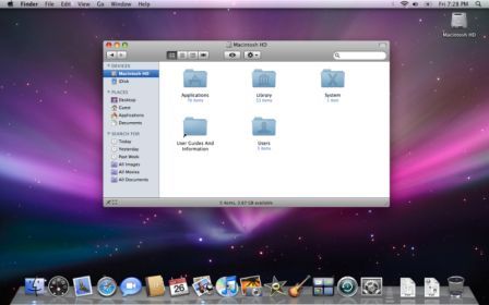
Apple OSX 10.5 Leopard, click to enlarge

Gnome 2.24, click to enlarge

KDE 4.2, click to enlarge
Personally I do not like much either Gnome (never appreciated, there are many religious wars about it 🙂 ), nè KDE4, remaining attached to KDE3 and not to this innovative method that does not want more icons on the desktop, but Plasmoids and other curious applet that wander onto our screen. On the other hand, even Windows Vista has been accused of, with its Aero, graphics too heavy… we will see, in a few months, what will come out from the new Windows 7.
Apple, on the other hand, within a few months will launch the new Snow Leopard 10.6, should not, however, contain graphic innovations, but should be a 10.5 revised and.
On the Linux, continues to dominate unchallenged Ubuntu (In this respect laws the article on the evolution and popularity of the leading Linux OS).
What will the future of operating systems? In view of the success in only 30 age, venture a prediction is really impossible…