How I sped up by 300% the loading of web pages

Google Webmaster Tools has an interesting feature (EXPERIMENTAL FUNCTIONS section -> PERFORMANCE OF THE SITE), that allows you to monitor the loading time of your web site.
The system analyzes a few dozen random pages, and averages the loading times.
As shown in this graph by Tues Kiss Metrics, the percentage of users who decide to abandon your site, before it has finished loading, increases dramatically with each passing second.
Backgrounds bigger than 1MB, sounds (avoid background music at any cost!), too many pictures on one page, javascript too are among the most common causes of excessive loading a web page.
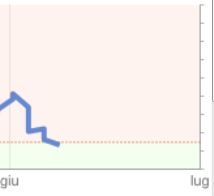
Without wasting further time, let's see the result, and then analyze how to get there:

The data clearly refer to the period that interests us, or the last month, and refer to this website.
At the time indicates a time average load of 1.4secondi (of less than 100 pages). Before the optimizations, as indicated in the graph, was well 4 second… too!
Eliminate unnecessary content!
No need to fill each page with dozens of useless effects, or high definition wallpapers (the resolution of the monitors used in most web, still has 1368 pixels wide). The users will feel less confused, and thank.
Group JavaScript and CSS
If a page requires javascript three for any reason, convenient to group them into a single js file. This will reduce server requests, determining factor in reducing the loading time. Same goes for style sheets.
Compress your images JPG and PNG without reducing the quality
Jpegoptim and PNGout are two excellent little programs (work from the command line) that allow, using different algorithms, to reduce the size of an image, without reducing the quality (lossless compression). Seeing is believing… the background image on this site, the many icons in PNG, and some photos, reductions have also 50%!
Minimize and compress your JavaScript and CSS files
Alcuni plugin Jquery js come, style sheets, or some very complex, Comments may be several, that help users to understand in detail what this or that line of code. Unfortunately, these comments, together with the spaces and the “head”, take up space. The browser is forced to… take the slalom between these parties which are only useful to a human eye.
Comes to the rescue Google minify, that eliminates all unnecessary parts of these files, saving several kilobytes.
Download it, uploaded to the folder “minutes” in your site, and open the page indirizzo_vostro_sito / min / builder.
Enter the various CSS (or JS) to compress, Click on UPDATE, and minify HTML tags will show you a beautiful and ready for use, to insert in your web pages instead of the usual (and numerous)
<link type=”text/css” rel=”stylesheet” href=[…..] />
<script type=”text/javascript” src=”…”></script>
So, you will make ONE call to style sheets, and ONE call to javascript.
Put the JavaScript in the footer
Some codes (as Queli counters), if they are not “asynchronous”, can be created for any reason a delay in the loading. If you are in the header (so at the site), these blocks will affect the rest of the page, that must wait for the resolution of any problems, before being loaded.
If you insert the javascript in the footer (ie at the end of the site), any loading problems will not cause an annoyance to users.
Specify the character encoding at the web server ONLY
If you use Apache, you can delete the html for the encoding tag in your pages, and enter directly into the file. htaccess:
AddDefaultCharset UTF-8
Enable the cache
In this way users BACK in your site, will have their browser's cache, without having to reload the new background, js, css and so on.
Always on. Htaccess:
<IfModule mod_headers.c>
<FilesMatch “\.(js|css)$”>
Header append Vary Accept-Encoding
Cache-Control: Private
</FilesMatch>
</IfModule>#include caching for images
<IfModule mod_expires.c>
ExpiresActive On
ExpiresByType image/gif “more access 1 week”
ExpiresByType image/jpg “more access 1 week”
ExpiresByType image/png “more access 1 week”
ExpiresByType image/x-icon “more access 360 days”
ExpiresByType text/css “more access 1 day”
ExpiresByType text/html “more access 1 week”
ExpiresByType text/javascript “more access 1 week”
ExpiresByType text/x-javascript “more access 1 week”
ExpiresByType application/javascript “more access 1 week”
ExpiresByType application/x-javascript “more access 1 week”
ExpiresByType application/x-shockwave-flash “more access 1 week”
ExpiresByType font/truetype “more access 1 month”
ExpiresByType font/opentype “more access 1 month”
ExpiresByType application/x-font-otf “more access 1 month”
</IfModule>
Enable GZIP compression
There are various methods, depending on whether one uses Apache or other webserver, and the method is explained at length in other sites, so no need to copy the code in this article.
Create a mobile version of site
Add, in your style sheet, fixes that allow you to view your site's iPhone, iPad, Android and similar terminals:
@media only screen and (min-device-width : 320px) and (max-device-width : 480px), only screen and (min-device-width : 480px) and (max-device-width : 800px) and (orientation : landscape), only screen and (device-width: 768px), only screen and (-webkit-min-device-pixel-ratio : 1.5), only screen and (min-device-pixel-ratio : 1.5), only screen and (-moz-min-device-pixel-ratio: 1.5)
{ MOBILE CSS CODE HERE }
for example, could reduce the size of the div, delete the background image, submenu screens are not suitable for any small, and so on. So, the load time on mobile devices can be drastically reduced.
By way of example, here are two screenshot showing the mobile version of this site on Android and iPhone: immagine1 / immagine2
After making these changes, add this tag html header, before loading the stylesheet:
<meta name =”viewport” content=”width=device-width, initial-scale=1.0, maximum-scale=1.0, user-scalable=no”/>
<meta name =”apple-mobile-web-app-capable” content=”yes”/>
<meta name =”apple-mobile-web-app-status-bar-style” content=”black-translucent”/>
Order, set the zoom level for mobile terminals, and prohibits the user to zoom (possibly breaking the layout). The last two are specific tags for IOS, and make your site more like an App, hiding the address bar of Safari.
BONUS: wordpress: automatically optimize all the JPG and PNG
The plugin SMUSH-IT allows you to do, automatically, what I just described above for static pages, or carry a “lossless compression” images, improving the load time of your WordPress blog.
E'tutto! Note that these fixes will help you get scores between 85 and 95 nei test Google Page Speed ed YSlow, resulting in overall improvements in optical positioning.
And you have some other trick to suggest? It accepts all! 🙂

